POSTS
Create a Chart from Comma-Separated Cell Values in Google Sheets
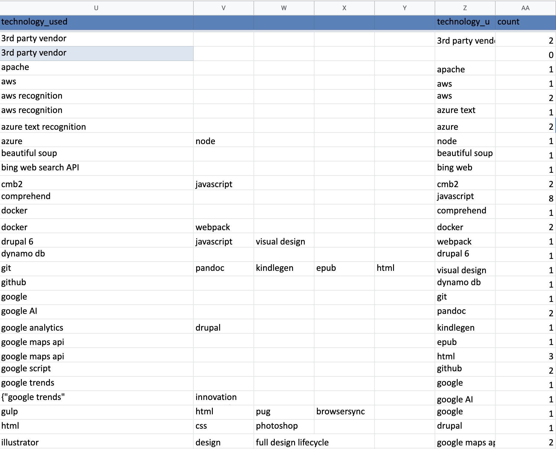
I had a column with row cells containing text with comma-separated values that I wanted to graph as a count. For example:
git, aws, google
In order to split comma separation so I can count, I went to the main menu “data” and chose “split text to columns”.
I then used the formula =UNIQUE(flatten(range)) to get just a unique list from the columns.
Following that, I created another column with =COUNTIF(range,criterion) and then I selected that column and “insert” and “chart” from the main menu.